From Data to Impact: Maximizing the Effectiveness of Your Sustainability Report Design

Experience the unique expertise of Slate of Swan – A Sustainability Report Design Agency.

Sustainability report design holds on the world of stakeholders’ experience. In today’s data-driven realm, the stakeholders are on a transformative journey.

In this article, we will delve into the strategies and best practices that can help you boost the persuasiveness of your sustainability report design.

From choosing the right visual elements to crafting engaging storytelling techniques, we will explore how to create reports that not only inform but also inspire action. 

Join us as we uncover the secrets to translating data into impact, and take your sustainability reporting to the next level.

Sustainability and ESG Impact Report Design Agency - Slate of Swan

Sustainability reports have seamlessly become a tool for organizations to showcase their commitment to environmental, social, and governance (ESG) practices.

The stakeholders are adopting a transparent lens to navigate their data-driven choices and decision making.

However, simply presenting data is not enough to captivate stakeholders and drive real impact.

The key lies in designing these reports, transforming complex data into compelling narratives that resonate with audiences.

Importance of Sustainability Report Design

Slate of Swan Impact Design element 1

Sustainability reports are more than just a collection of facts and figures. 

They are powerful communication tools that allow organizations to share their sustainability achievements, goals, and strategies with stakeholders. 

However, without effective design, these reports can easily become overwhelming and fail to engage readers. 

Do you know as an ESG report design agency or Sustainability Report Design Agency, we have designed more than 750 reports.

The design of a sustainability report or an ESG Report plays a crucial role in conveying information in a clear and visually appealing manner. It helps to transform complex data into a compelling narrative that resonates with stakeholders and inspires action.

One of the key advantages of a well-designed sustainability report is its power to communicate intricate information in a consumable format. By organizing data and presenting it in a visually appealing way, stakeholders can easily understand the progress and impact of an organization’s sustainability efforts. 

A well-designed report also helps to establish credibility and build trust with stakeholders. When information is presented in a coherent and transparent manner, it enhances the perception of an organization’s commitment to sustainability.

Another important aspect of ESG Report or sustainability report design is its ability to evoke an emotional response from readers. While data and facts are crucial, it is the emotional connection that drives action. 

By incorporating storytelling techniques into the sustainability or ESG report design, organizations can create a narrative that resonates with stakeholders on a deeper level. 

When readers feel connected to the issues and understand the impact of their actions, they are more likely to support and engage with an organization’s sustainability vision and initiatives.

In summary, the design of a sustainability report is essential for effectively communicating an organization’s sustainability efforts. It helps to remodel complex data into an irresistible narrative, making it easier for stakeholders to comprehend and engage with the information. 

Additionally, a well-designed sustainability or ESG report can evoke an emotional response and inspire action, ultimately driving a positive impact.

Crafting an Effective Sustainability Report Design – The Key Elements
Slate of Swan Impact Design Element 2

When it comes to designing a sustainability report, there are several key elements to consider in order to maximize its effectiveness. 

These elements include layout and structure, visual elements, storytelling techniques, and user experience. By carefully considering and implementing these elements, organizations can create report designs that are not only visually appealing but also impactful.


Layout, Structure, and Content Hierarchy

The layout and structure of a sustainability report should be intuitive and easy to navigate. It is essential to organize the information in a cogent manner, making it easy for readers to find the information they are looking for. 

This can be accomplished through content hierarchy – with the use of headings, subheadings, and a table of contents. 

In addition, the report should have a clear and crisp executive summary that provides a synopsis of the pivotal findings and recommendations.

Data Visualization and Designing Elements

Visual elements play a crucial role in sustainability report design. They help to break up dense text and make the information more visually appealing and engaging. 

Data visualization techniques such as charts, graphs, and infographics can be used to present complex data in a clear and concise manner. 

These visual elements not only make the information easier to understand but also help to highlight key trends and patterns.

Storytelling in Sustainability Reports

Storytelling is another important aspect of sustainability report design. 

By incorporating storytelling techniques in ESG reports, organizations can create a narrative that connects with readers on an emotional level. This can be realized through the use of real-life examples, case studies, and personal stories. 

With every real-life story or stories from the field, organizations can engage readers and inspire them to take action.  

Prioritizing Exerience in Design and Communication

User experience is a critical consideration in sustainability report design. The report design should be conceived with the reader in mind, ensuring that it is accessible and easy to navigate. 

This can be achieved through the use of distinct headings, bullet points, and a consistent design throughout the report. Additionally, the report should be mobile-friendly, as an increasing number of stakeholders access information on their smartphones and tablets. 

In summary, the key elements of an effective sustainability report design include layout and structure, visual elements, storytelling techniques, and user experience. 

By carefully considering and implementing these elements, organizations can create reports that are visually appealing, engaging, and impactful.

Incorporating Data Visualization in Sustainability Report Design

Slate of Swan Impact Design element 1

Data visualization is a powerful tool that can greatly enhance the effectiveness of sustainability reports. 

By presenting data in a visual format, organizations can make complex information easier to understand and engage with. In this section, we will explore the benefits of data visualization and provide tips on how to efficiently integrate it into your sustainability report design.

One of the key perks of data visualization is its ability to simplify complex data. Sustainability reports often contain a wealth of information, including environmental metrics, social impact data, and governance performance. 

By using charts, graphs, and infographics, organizations can present this information in a way that is easy to digest and communicate. Visual representations of data can help stakeholders quickly identify trends, patterns, and key insights.


Another benefit of data visualization is its ability to engage readers. Humans are visual creatures, and we are instinctively drawn to images and visual representations. 

By incorporating visually appealing charts and graphs into your sustainability report, you can capture the attention of readers and encourage them to explore the data further. 

Try to make these charts and graphs as simple as possible communicating one message at a time. This can help to increase the impact and effectiveness of your sustainability reporting efforts.

Hands on Tips from a Leading Sustainability Report Design Agency


When incorporating data visualization into your sustainability report design, it is important to consider the following tips:

Choose the Right Kind of Chart or Graph for Your Data

Various types of data extend themselves to different types of visualizations. Bar charts are ideal for comparing data, line charts are useful for showing trends over time, and pie charts are effective for displaying proportions. 

Choose the visualization that best represents your data and helps to convey your message.

Keep it Transparent

While data visualization can be powerful, it is important to avoid inundating readers with too much information. Keep your visualizations simple and focused, highlighting the key data points and insights. Avoid cluttering your report with unnecessary visuals that may distract from the main message.

Use Color Strategically

Color is a powerful tool in data visualization, helping to highlight key messages and create visual interest. However, it is important to use color strategically and avoid overwhelming readers with a rainbow of hues. 

Choose a color palette that is visually attractive and aligns with your organization’s branding or theme.

Provide Context and Explanations

While visualizations can make data easier to comprehend, it is important to provide context and explanations to ensure that readers fully absorb the information. 

Include captions, labels, and annotations that provide additional context and help readers interpret the data correctly.

By incorporating data visualization into your sustainability report design, you can enhance the effectiveness and impact of your sustainability or ESG reporting efforts. 

Visual representations of data can simplify complex information, engage readers, and help to convey your message more effectively. 

When used strategically and thoughtfully, data visualization can be a powerful tool in driving sustainability impact.

Choosing the Right Color Palette and Typography for Your Sustainability Repor

Slate of Swan Impact Design element 1

The design of a sustainability report goes beyond just the layout and structure. The choice of color palette and typography plays a crucial role in creating a visually appealing and impactful report. 

In this section, we will explore how to choose the right color palette and typography for your sustainability report design.

The color palette of your sustainability report should align with your organization’s branding and convey the desired message. 

Different colors evoke different emotions and have different meanings. It is imperative to choose colors that resonate with your target audience and line up with the purpose of your report. 

For example, green is often associated with sustainability and the environment, while blue can convey trust and reliability.

Hands on Tips from a Leading Sustainability Report Design Agency

When selecting a color palette, it is important to consider the following tips

Keep it Consistent

Consistency is key when it comes to color. Choose a color palette that is consistent throughout your report, ensuring that the colors complement each other and create a close-knit look and feel. 

This will help to create a visually appealing and professional report.

Consider Accessibility

Accessibility is an important consideration in report design. Ensure that the colors you choose have adequate contrast, making it effortless for readers to read and interpret the information. 

This is especially important for visually impaired readers who may depend on screen readers or other assistive technologies.

Use Color Strategically

Color can be used strategically to highlight key information and draw attention to important data points. 

Use color sparingly and purposefully, ensuring that it enhances the readability and impact of your report. Avoid using too many colors or overwhelming readers with a rainbow of hues.

Typography is another important aspect of sustainability report design. The choice of font can greatly impact the readability and overall aesthetic of your report. 

When choosing a font, it is important to select one that is easy to read and aligns with your organization’s branding. Sans-serif fonts are often picked-up for their clean and contemporary look, while serif fonts can convey a more classical and formal feel.

Hands on Tips from a Leading Sustainability Report Design Agency


When choosing typography for your sustainability report, consider the following tips.

Ensure Readability

The primary function of typography is to make the text easy to read. Choose a font that is legible and easy on the eyes, even in small sizes. Avoid using overly ornate or stylized fonts that may hinder readability.

Use Hierarchy and Formatting

Typography can be used to create hierarchy and structure in your report. Use 2-4 font sizes, weights, and styles (preferably from the same font family) to make a distinction between headings, subheadings, and body text. 

This will make it simpler for readers to navigate the report and find the specific information they are looking for.

Be Consistent

Consistency is key when it comes to typography. Choose one or two fonts and use them consistently throughout your report. This will create a cohesive and professional look and feel.

By carefully selecting the right color palette and typography for your sustainability report design, you can create a visually appealing and impactful report. 

The colors you select should align with your organization’s branding and transport the desired message, while the typography should be easy to read and regular throughout the report. 

When used effectively, color and typography can greatly enhance the visual appeal and impact of your sustainability report.

Utilizing Infographics and Charts to Convey Sustainability Data

Slate of Swan Impact Design element 1

Infographics and charts are powerful tools that can greatly enhance the effectiveness of your sustainability report.

By visually representing complex data, infographics and charts make it easier for readers to comprehend and engage with the information. In this section, we will explore how to effectively utilize infographics and charts to convey sustainability data in your report.

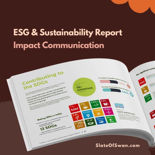
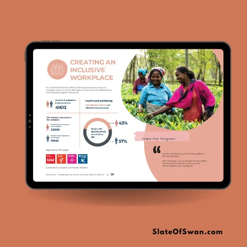
Infographics are visual representations of information or data that present complex concepts or data in a simplified and visually appealing manner. 

They can be used to transmit a wide range of information, from statistics and trends to processes and systems. Infographics are particularly effective in sustainability reports as they can help to simplify complex sustainability data and make it more accessible to stakeholders

Hands on Tips from a Leading Sustainability Report Design Agency

When creating infographics for your sustainability report, consider the following tips:

Identify the Key Message

Before creating an infographic, identify the key message or story you want to convey. What is the main takeaway you want readers to have? Once you have identified the key message, you can design the infographic to support and reinforce that message.

Keep it Simple

Infographics should be visually appealing but not overwhelming. Keep the design simple and focused, highlighting the key data points and insights. 

Avoid cluttering the infographic with unnecessary visuals or excessive text.

Use Visuals Strategically 

Visuals are the heart of an infographic. Use icons, illustrations, and other visual elements to transmit information and make it more relatable. Visuals should be relevant to the data and help to tell the story.

Charts and graphs are another effective way to convey sustainability data in your report. They can help to highlight trends, patterns, and key insights, making it easier for stakeholders to understand and interpret the data. 

Keep it simple: Like infographics, charts and graphs should be kept simple and focused. 

Highlight the key data points and ensure that the chart or graph is easy to read and interpret. Avoid cluttering the visual with unnecessary gridlines or labels

By utilizing infographics and charts in your sustainability report, you can make complex data more accessible and engaging. 

Infographics can simplify complex concepts and data, while charts and graphs can highlight key trends and insights. 

When used strategically and thoughtfully, infographics and charts can greatly enhance the impact and effectiveness of your sustainability reporting efforts.

Enhancing User Experience with Interactive Elements in Sustainability Report Design

User experience (UX) is a critical consideration in sustainability report design. A well-designed report should be easy to navigate, accessible, and engaging for readers. 

In this section, we will explore how to enhance the user experience with interactive elements in your sustainability or ESG report design.

Interactive elements can greatly enhance the user experience of your sustainability report. 

They can make the report more engaging, enable readers to explore the data further, and provide a more immersive experience. 

Some examples of interactive elements that can be incorporated into your sustainability report include interactive charts and graphs, clickable maps, and embedded videos.

Enhancing User Experience with Interactive Elements in Sustainability Report Design

Hands on Tips from a Leading Sustainability Report Design Agency

When incorporating interactive elements into your sustainability report, consider the following tips.


1. Choose Interactive Elements That Support Your Message 

The interactive elements you choose should enhance the message and purpose of your sustainability report. 

They should provide additional information or context that is relevant to the data and insights you are presenting. Avoid adding interactive elements for the sake of novelty or aesthetics.

2. Ensure Accessibility 

Accessibility is an important consideration when designing interactive elements. Ensure that the interactive elements can be accessed and used by all readers, including those with disabilities. 

Provide alternative text for images and videos, and ensure that interactive elements are compatible with assistive technologies.

3. Test and Optimize 

Before publishing your well designed ESG report or sustainability report, thoroughly test the interactive elements like weblinks, pop-ups, or page navigation to ensure that they function as intended.

Share this post

Category: Blog, Sustainability Report, Report Designing Agency, Copyediting, Impact Communication, SDG Communication

About the author

Medha basu

Medha Basu currently serves as the Lead – Communication at Slate of swan . In her role, Medha primarily works on communication, engagement, first mile activities and data analytics.
Explore Our Slate

Let's connect and collaborate

Just Say
Speak to us or drop us a WhatsApp message
This website uses cookies
We use cookies to give you the best possible experience with Slate of swan. Some are necessary for this site to function; others help us understand how you use the site to improve the digital experience.