What is intangible cultural heritage?
So, what is intangible cultural heritage? Simply put, it’s the traditions, expressions, skills, and knowledge passed down from one generation to the next. It’s different from buildings or monuments—those are tangible. Intangible heritage is about what we do, say, and celebrate.
It includes:
- Oral traditions (like storytelling and poetry)
- Performing arts (like music, dance, and theater)
- Social practices and rituals (like festivals or marriage customs)
- Knowledge of nature and the universe (like traditional medicine)
- Craftsmanship (like weaving or pottery)
Unlike tangible heritage, these elements are alive. They evolve as societies change, adapting without losing their essence.
Why intangible cultural heritage matters
Every corner of the globe has its treasure trove of traditions. Let’s take a quick journey:
Building identity and belonging
Intangible cultural heritage shapes who we are. Through traditions, we learn values, ethics, and ways of life. A folk song sung to a child, a festival celebrated every year, or an ancestral story—all of these build a sense of identity and community.
When we celebrate our traditions, we honor the people who came before us and reaffirm where we belong.
Strengthening social bonds
When communities come together for festivals, ceremonies, or performances, they build relationships. Traditions create shared experiences. This strengthens trust, empathy, and mutual respect—essentials for any healthy society.
Inspiring creativity and innovation
Traditional arts, crafts, and practices inspire new ideas. Designers, artists, musicians, and storytellers often draw from cultural heritage, creating fresh expressions while keeping old wisdom alive.
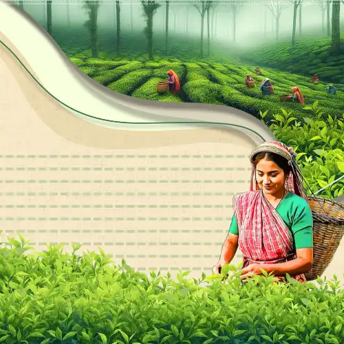
Supporting sustainable development
Craft traditions, like handloom weaving or indigenous farming, promote eco-friendly practices. They teach sustainable ways of living in harmony with nature.
Promoting diversity and tolerance
By exploring the tangible and intangible cultural heritage of different groups, we foster cultural diversity and understanding. It reminds us that no one culture is superior; each offers unique contributions to humanity’s shared story.
Key examples of intangible cultural heritage around the world
Every corner of the globe has its treasure trove of traditions. Let’s take a quick journey:
The Japanese tea ceremony
In Japan, the chanoyu (tea ceremony) is a profound cultural experience. It’s about more than drinking tea—it’s a meditation on harmony, respect, purity, and tranquility. The slow, mindful process reflects centuries of Japanese philosophy and aesthetics.
The griot tradition of West Africa
Griots are oral historians and musicians who preserve their communities’ memories through songs and storytelling. They are living archives, connecting the past with the present through vibrant narratives.
Mexico’s day of the dead
Día de los Muertos is a colorful festival that celebrates ancestors. Families build altars, share food, music, and dances in honor of those who have passed. It’s a joyful affirmation that death is part of life, not the end.
Each of these traditions reveals how communities express universal human values in wonderfully diverse ways.
Exploring intangible cultural heritage in India
India is often called a land of stories—and rightly so. When it comes to intangible cultural heritage in India, the richness is breathtaking.
Classical dance forms
Dance forms like Bharatanatyam, Kathak, Odissi, and Kathakali are not just performances. They are narratives set to rhythm and movement, preserving myths, values, and spirituality through generations.
Oral traditions and epics
From ancient epics like the Ramayana and Mahabharata to regional folklore, India’s oral storytelling traditions weave together history, ethics, and philosophy. These stories are performed in villages, temples, and homes, keeping cultural wisdom alive.
Traditional crafts
Handloom weaving, pottery, embroidery, metalwork—every region in India has its signature craft. These are more than aesthetic practices; they carry the knowledge of materials, environment, and centuries-old techniques.
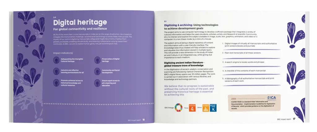
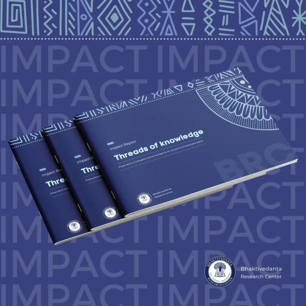
Beyond performing arts and crafts, another vital part of India’s intangible heritage lies in its ancient manuscripts, which hold centuries of wisdom and cultural depth.
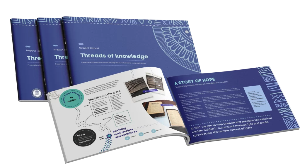
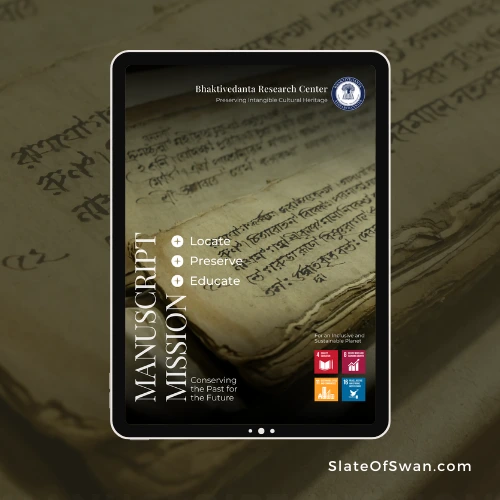
Preserving ancient Indian manuscripts
India’s ancient manuscripts are a treasure trove of knowledge, philosophy, and culture, forming a vital part of the country’s intangible cultural heritage.
Written on materials like palm leaves, birch bark, and handmade paper, these manuscripts cover diverse fields – ranging from spirituality and medicine to astronomy and art.
Texts like the Vedas, Upanishads, classical Sanskrit literature, and regional wisdom traditions offer a glimpse into the intellectual and cultural life of ancient India.
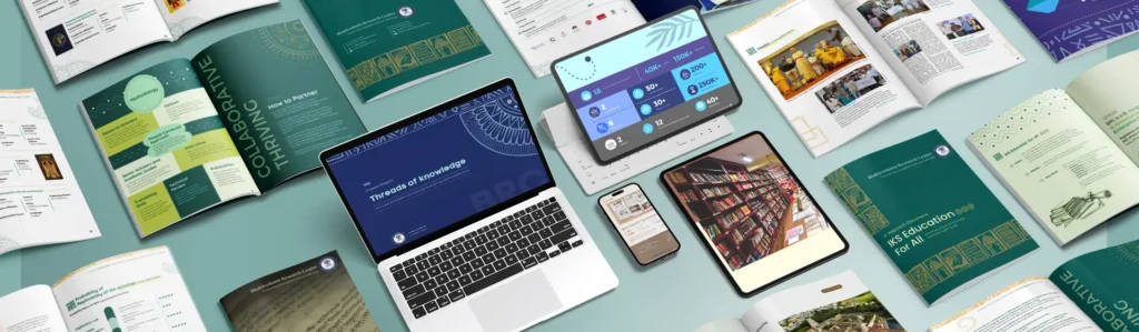
However, many of these priceless works are at risk due to age, environmental damage, and neglect. Preserving them through digitization, conservation programs, and community-driven efforts ensures that this rich legacy remains accessible for future generations.
Protecting ancient manuscripts is not just about saving texts; it is about safeguarding the spirit and depth of Indian civilization itself.
Globalization and Its impact on intangible cultural heritage
Globalization has connected the world like never before. But it has also posed challenges to safeguarding traditional practices.
Risks of globalization
1. Loss of traditions
As cities grow and lifestyles change, younger generations may lose interest in traditional arts and customs.
2. Commercialization
Some traditions are turned into tourist attractions, losing their authenticity.
3. Cultural homogenization
Global pop culture can sometimes overshadow local expressions.
Opportunities through globalization
1. Digital preservation
Technology allows communities to record, share, and archive their heritage.
2. Cross-cultural exchange
When respectfully done, globalization enables us to appreciate and learn from each other’s traditions.
Thus, the challenge is to preserve traditions while letting them adapt to modern contexts.
The role of communities in preserving intangible cultural heritage
Communities are the true guardians of their traditions. Preservation efforts must start at the grassroots level.
How communities can safeguard heritage
1. Passing knowledge
Elders teaching skills and traditions to youth.
2. Organizing cultural events
Festivals, workshops, and exhibitions to keep practices alive.
3. Collaborating with institutions
Governments, NGOs, and cultural bodies can provide resources, training, and platforms.
Every dance taught, every song sung, every craft practiced is an act of cultural resilience.
The future of intangible cultural heritage
The future of intangible cultural heritage depends on conscious, collective efforts.
Innovative approaches
1. Technology
Virtual reality experiences, podcasts, digital archives—new ways to experience traditions.
2. Education
Schools integrating local culture into their curriculum.
3. Youth engagement
Making traditions relevant and exciting for the younger generation.
Heritage isn’t static—it lives and breathes with us. And it must continue to evolve without losing its soul.
International standards: Protecting our cultural legacy
Global organizations like UNESCO and the International Finance Corporation (IFC) have developed frameworks to protect culture.
IFC’s performance standard 8: Cultural heritage outlines how businesses must safeguard heritage during development projects. It stresses the importance of:
- Identifying cultural heritage early
- Respecting community practices
- Protecting cultural expressions from harm
International guidelines like these ensure that as we build the future, we don’t erase the past.
Final thoughts: Our shared responsibility
Intangible cultural heritage is not just a relic of the past. It’s a living, breathing testimony to human creativity, resilience, and connection.
By valuing and protecting our traditions, we:
- Celebrate who we are
- Strengthen community bonds
- Inspire future generations
At Slate of Swan, we believe that storytelling, culture, and design can transform the way we engage with heritage. Through thoughtful narratives and creative work, we are committed to keeping the spirit of world intangible cultural heritage alive and thriving.
Let’s honor our ancestors, enrich our present, and inspire our future – one tradition at a time.